
By Daniel Durling (Senior Data Scientist) and Dave Poole (Principal Data Engineer)
Background
Welcome to Part Two in our series on Snowflake Statistical Functions. Here we will look at some of the statistical functions which generate multiple values that enable you to understand your data better.
A quick reminder that in Part One we looked at a series of functions which return a single value and how that single value can help you understand your data. Part One is available here. In part three we will look at combining the outputs of these functions using one of our key visualisation tools; AWS QuickSight.
Snowflake statistical functions (part 2)
- CUME_DIST
- PERCENTILE_CONT
- PERCENTILE_DISC
- RANK / DENSE_RANK / PERCENT_RANK
- COVAR_POP / COVAR_SAMP
- CORR
Distributions & Correlations
We saw in part one how single-value summary statistics can help us understand our data. However, in most cases, a single value such as the average, median or mode does not provide enough information. We would be better off looking at some form of distribution of values. Indeed, Snowflake provides us with some useful functions in this space:
CUME_DIST
The CUME_DIST function allows you to calculate the cumulative distribution of the data within a table or within partitions of that table. To put this another way, we are looking at the data within a table/group of entries within a table, ordering them by a given variable, and then calculating how much of the whole of each group (and all groups before it in the ordering) takes up. We then normalise this to a value between 0 and 1. This 0 – 1 range represents percentages where 1 is 100%, 0.35 is 35%, etc.
Try the following example based on the SNOWFLAKE_SAMPLE_DATA database.
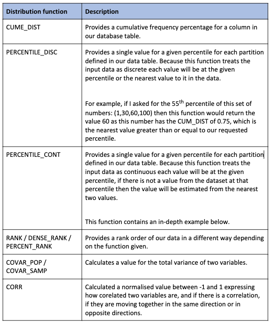
SELECT

    O_CLERK,

    O_ORDERDATE,

    CUME_DIST() OVER (PARTITION BY O_CLERK ORDER BY O_ORDERDATE) AS Cummulative_Frequency

FROM ORDERS

WHERE O_ORDERDATE BETWEEN '1997-01-01' AND '1997-12-31'
This shows us the cumulative frequency of orders by date for each clerk. The records will appear as follows:
In addition to this, look at the CUMMULATIVE_FREQUENCY column carefully. Why are there two values the same? Because the cumulative frequency is ordered by O_ORDERDATE the column represents the cumulative frequency for the day, not just the individual records.
There are 261 records for Clerk#000000968
- Each record is approximately 0.38% (1 / 261)
- 2 orders occur on 1st January 1997 so 2 x 0.38% = 0.76%
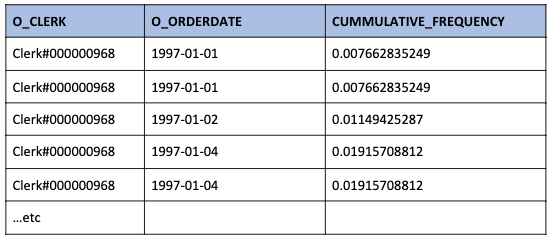
This can be a confusing representation so we can aggregate these results giving a less confusing answer:
WITH daily_sales(O_Clerk, Order_Date, Cummulative_Frequency)

AS (

  SELECT

    O_CLERK,

    O_ORDERDATE,

    CUME_DIST() OVER (PARTITION BY O_CLERK ORDER BY O_ORDERDATE) AS Cummulative_Frequency

  FROM ORDERS">

  WHERE O_ORDERDATE BETWEEN '1997-01-01' AND '1997-12-31'

)

SELECT

    O_Clerk,

    Order_Date,

    MAX(Cummulative_Frequency),

    COUNT(*) AS Daily_Orders

FROM daily_sales

GROUP BY O_Clerk, Order_Date

ORDER BY O_Clerk, Order_Date;
This gives less confusing results:
CUME_DIST Benefits:
The CUME_DIST function is useful because its output allows us to describe the probability of random variables within our data. These distributions can then be compared from group to group, allowing us to see the separation/overlap of our variables.
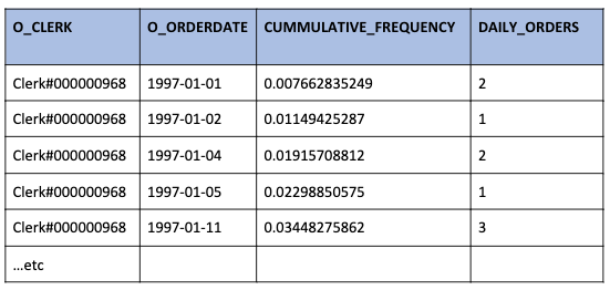
As a practical example imagine that you want to run an email campaign. You want to know if your customer segmentation model was successful. You have two groups of email addresses
- Control group selected at random
- Test group chosen using your segmentation model
The chart below is an example showing the cumulative distribution of responses for your two groups. Here we have:
X-axis = Percentage of each customer group contacted
Y-axis = Percentage of responses coming from the percentage of the customers contacted
The straight blue line represents the responses from your control group. If your control group is a truly random selection then the response rate will be constant. When looking back on your campaign results any two random samples from your control group should produce the same response rate.
The curved red line represents the response rate if our customers were ranked by our scoring model.
You can see that the scoring model is successful as the campaign returns 70% of responses from 30% of customers.
![]()
![]()
Percentile vs percentage
Next, we look at two percentile calculation functions. Remember that a percentile is not a percentage. A percentile is used to return to us a ranked value, whereas a percentage allows us to compare different quantities of different things in a consistent way. A percentage gives us information on ratios and proportions. A percentile tells us where a given value is in relation to all the other values within the dataset.
If you get 80% on a test of 100 questions, we know you got 80 questions correct. However, we do not know anything about how well you did in comparison to others. If your score is in the 80th percentile, we know that 80% of the scores of people who took the test are equal to or below your score.
Percentiles are a common type of Quantile. Other common types are quartiles (from which we can calculate the interquartile range – you might be familiar with this from viewing Box plots).
PERCENTILE_DISC vs PERCENTILE_CONT
The table below summarises the difference between the two functions:
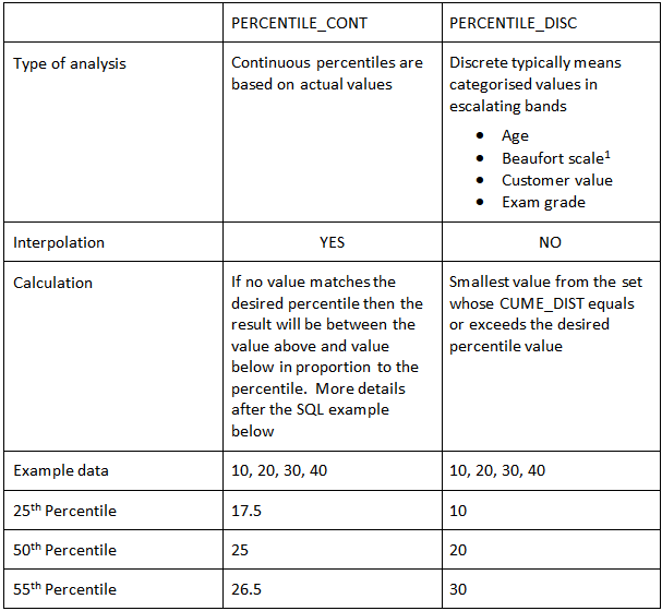
1 If you would like to know more about the Beaufort scale check out this link.
Ultimately, you can experiment with the percentiles by editing the following query.
 SET Desired_Percentile=0.55;


SELECT Item_Code,

    $Desired_Percentile,

    PERCENTILE_DISC($Desired_Percentile) WITHIN GROUP (ORDER BY Item_Value) AS Discrete,

    PERCENTILE_CONT($Desired_Percentile) WITHIN GROUP (ORDER BY Item_Value) AS Continuous

FROM(

  SELECT 1 AS Item_Code,10 as Item_Value

  UNION ALL

  SELECT 1 AS Item_Code,20 as Item_Value

  UNION ALL

  SELECT 1 AS Item_Code,30 as Item_Value

  UNION ALL

  SELECT 1 AS Item_Code,40 as Item_Value

) AS DT

GROUP BY Item_Code;
How PERCENTILE_CONT is calculated
Take your list of values and arrange it in ascending order
- Calculate list position (desired percentile / 100) * (number_of_datapoints – 1) + 1
- Then, Calculate the integer position by rounding down the list position
- Calculate the decimal part of the list position by using the Datapoint at the integer part of the position in the list + (Datapoint at (Integer list position +1) – Datapoint at list position) x decimal part of list position in the list
Let us work through the 55th-percentile example
- List Position = ( 55/100 ) * (4-1) +1 = 0.55 * 3 – 1 = 2.65
- Integer List Position = 2
- The decimal part of List Position – 0.65
- The data point for List Position= 20
- Datapoint for next List Position = 30
- ( 30 – 20 ) * 0.65 + 20 = 26.5
Percentile calculation is of great use when understanding where a given value is in relation to other values within the same group of data.
RANK / DENSE_RANK / PERCENT_RANK
Next, let us look at these three ranking functions. These functions allow us to see the ordering of variables within our data in different ways. This information is valuable as it quickly allows us to understand the number of discrete categories within a subgroup, and the order they are in.
RANK and DENSE_RANK do the same thing in slightly different ways.
Let us imagine an Olympic cycle race where the winners tie. We shall ignore the coin toss that decides the winner under Olympic rules.
For the 2 winners, RANK and DENSE_RANK = 1
For the person in 3rd place RANK = 3 but DENSE_RANK = 2
Or to put it another way
- RANK will tell us the top 3 runners by time.
- DENSE_RANK will tell us the top 2 times, although this may be more than 2 runners.
We can demonstrate this in an example query based on the TPCH_SF1.PART table within the SNOWFLAKE_SAMPLE_DATA database:
SELECT

P_RETAILPRICE,

RANK() OVER (ORDER BY RETAILPRICE DESC) AS Ranked_Price,

DENSE_RANK() OVER (ORDER BY RETAILPRICE DESC) AS Dense_Ranked_Price,

PERCENT_RANK() OVER (ORDER BY RETAILPRICE DESC) AS Percent_Ranked_Price,

    FROM TPCH_SF1.PART;
Furthermore, let us look at the results for the top 3 prices:
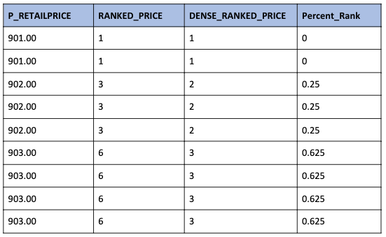
We can see that DENSE_RANK identifies the top three prices whereas RANK shows that the top three prices cover 9 products.
PERCENT_RANK returns the rank but is specified as a percentage ranging from 0.0 to 1.0.
From the documentation, those items ranked in 1st place will be assigned zero percent. From that point on the calculation is (rank -1) / (n – 1).
n – 1 = 8 so for the other rows we can slot in the rank to see how the percent_rank was calculated
- (3 – 1) / 8 = 0.25
- (6 – 1) / 8 = 0.625
You will see this rank is similar (but different) to our CUME_DIST function above.
These ranking functions allow us to create and save a given order to our data. We can of course create multiple rank columns depending on what we might do with the data.
COVAR_POP / COVAR_SAMP
These two covariance functions are similar to the Variance function we looked at in Part One. The table below helpfully compares them:
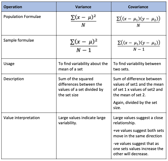
Care must be taken in calculating and interpreting covariance
- Both sets should use the same units of measure
- The numbers produced can be almost any value so they must be interpreted based on the units of measure.
Just like how the variance in part one allows us to calculate the (in this writer’s opinion) much more useful standard deviation; the covariance allows us to calculate the more useful correlation coefficient.
CORR
The CORR function produces the correlation coefficient between two sets of values. This function returns to us a value between -1 and 1 where:
- -1 = where when one variable goes up the other goes down
- 0 = No correlation
- +1 = As one value goes up, so too does the other.
The correlation coefficient is calculated using the covariances we calculated above as follows:
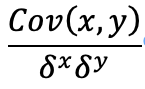
The bottom half of the fraction is the multiplication of the standard deviations for the two sets.
Compare the various statistics for the supply cost and retail price for each brand in the SNOWFLAKE_SAMPLE_DATABASE:
SELECT

P.P_BRAND,

    COUNT(*) AS Number_Of_Parts,

COVAR_POP(S.PS_SUPPLYCOST, P.P_RETAILPRICE) AS Covariance_Cost_Vs_Sales,

    CORR(S.PS_SUPPLYCOST, P.P_RETAILPRICE) AS Correlation_Coefficient,

    AVG(S.PS_SUPPLYCOST) AS Average_Supply_Cost,

    STDDEV(S.PS_SUPPLYCOST) AS Standard_Deviation_Supply_Cost,


    AVG(P.P_RETAILPRICE) AS Average_Retail_Price,

    STDDEV(P.P_RETAILPRICE) AS Standard_Deviation_Retail_Price

FROM PARTSUPP AS S

INNER JOIN PART AS P

    ON PS_PARTKEY = P.P_PARTKEY

GROUP BY P.P_BRAND
The results show the relationship between supply cost and retail price is almost non-existent. This lack of a relationship is valuable information and puts down a marker for current correlation, and compare our data to our prior thoughts and gut instincts.
Correlation between variables is an easy-to-understand statistic which can reveal an underlying relationship you were unaware of.
If you analyse the correlations between all the possible pairs of the items your company sells, you will no doubt find some correlations you were unaware of. Using this information, you can then devise strategies to emphasise this correlation. For example; placing these items close together within the store, and offering a discount on the lower margin item to test if it will generate an increase in sales of the lower margin item and the higher margin item leading to an increase in profits.
Snowflake Statistical Functions: Conclusion
In this second part of our series on statistical functions in Snowflake, we have highlighted some of what we think are the most useful functions which generate more than a single value / can be used to create more than one value (for functions which generate a single value please check out Part One). We looked at Cumulative distribution, discrete and continuous percentile calculations, and three different types of ranking functions.
These functions (alongside those we looked at in Part One) help us understand the datasets we are working on. Finally, In part 3 of this series, we will look at visualising these summarising data points alongside our actual data.
Found this useful? Fancy a chat about statistics and Snowflake? Let us know here